
티스토리 뷰
저번 편에 이어서 계속
3. 색상 변수
한 플랫폼 내에 쓰이는 색은 몇 가지로 통일 시킬 필요가 있다. 특히 같은 태그나 특성은 같은 폼, 즉 같은 글자 크기, 색깔, 행간, 자간을 사용해야 편안하게 볼 수 있고, 더 나은 사용자 경험을 제공할 수 있다.(너무 당연한 얘기인데도 막상 코드 짜보면 그렇게 하기 정말 힘들다는 것)
그 중 제일 많이 귀찮아 하는 것 중의 하나가 바로 색상. 여러가지 색을 지정해놔서 제목에는 파란색, 부제목에는 초록색, 본문에는 검정색, 호버 할 때는 짙은 회색, 인포메이션에는 옅은 회색..그거 호버 시에는 더 옅은 회색...어쨌든 미리 정해놨다고 치고, 메모장에 각 색상표를 주욱 넣어놓고 마크업 할 때 해당 색상표를 복붙하는 것이 그나마(?) 체계적으로 색을 가져다 쓰는 과정일 것이다.(아니면 처음부터 라이브러리의 힘을 빌렸을 수도) 그런데 이렇게 하고나면 어떤 문제가 발생하냐면 수정할 때 이게 무슨 색이었는지 찾기 정말 힘들다는 것이다. 에디터에서 색을 미리보기로 보여준다고는 하지만 비슷한 회색끼리 어떻게 구별할 것인가? 숫자를 대강 외워서 써도 되지만 굳이? 그렇게 고생할 필요가 없다. 위에 한글로 색을 이름 지었듯이 우리가 쓸 코드에서도 변수로 선언해 가져다가 쓰면 된다. 그렇게 되면 나중에 유지보수가 매우 쉬워지리라는 건 불 보듯 뻔한 일. 파란색을 지정했는데 클라이언트가 파란색 혐오증이 있어서 빨간색으로 죄다 바꾼다던가, 빨간색의 농도를 10단계로 나눠서 간신히 마크업 해놨더니 그 중에 4번째로 진한 거는 조금 덜 진하게 해줬으면 좋겠다던가. 별의 별 일이 다 있을 것이니 미리미리 준비하자. 이렇게 설명했는데도 필요성을 못 느끼겠으면 직접 지옥을 경험해보는 것도 좋은 방법이다.
/* _colors.scss */

$primary: #022c43;

$blue: #115173;
$blue-dark: #053f5e;
$blue-light: #27607e;

$black: #000;
$white: #fff;
$gray: #7e9aab;
$yellow: #ffd700;
$red: #eb4335;

$border: #a9c0cd;
$background: #f2f2f2;
이 변수들을 어떻게 활용하는지는 밑의 버튼 모듈에서 확인할 수 있다.
4. 버튼 모듈
버튼을 컴포넌트로 만들어서 여기저기 UI만 가져다 쓰고, 전달할 값은 props를 활용하고 있을 것이다. 프로토타입을 만들면서 플랫폼에 들어갈 모든 버튼 타입은 이미 다 만들었을 것이고, 그 중 최종안으로 선택한 버튼의 타입들을 몇 가지로 추렸으리라 믿는다. 그럼 그 버튼들을 만드는 방법은 취향의 영역일 것인데, 내가 사용한 방법은 아래와 같다.
/* _button.scss */

@mixin button-color($color) {
  background: $color;
  &:hover {
    background: lighten($color, 10%);
  }
  &:active {
    background: darken($color, 10%);
  }
  &.outline {
    color: $color;
    background: none;
    border: 1px solid $color;
    &:hover {
      background: $color;
      color: white;
    }
  }
  &.text {
    color: $color;
    font-weight: 500;
    background: none;

    border: none;
    border-radius: 4px;
    &:hover {
      font-weight: 600;
      color: darken($color, 10%);
      background: lighten($background, 5%);
    }
    &:active {
      font-weight: 700;
      color: $color;
      background: none;
    }
  }
}

.Button {
  color: white;
  font-weight: bold;
  outline: none;
  border-radius: 4px;
  border: none;
  cursor: pointer;
  padding: 0 1rem;

  /* size */
  &.large {
    height: 3rem;
    font-size: 1.25rem;
  }
  &.medium {
    height: 2.25rem;
    font-size: 1rem;
  }
  &.small {
    height: 1.75rem;
    font-size: 0.875rem;
  }

  /* color */
  &.blue {
    @include button-color($blue);
  }
  &.gray {
    @include button-color($gray);
  }
  &.yellow {
    @include button-color($yellow);
  }

  & + & {
    margin-left: 1rem;
  }
}
믹싱을 사용해서 마우스 호버와 액티브 효과를 설정하고, 보더만 있는 버튼, 보더 없는 버튼 등을 추가로 설정해줬다. 버튼을 컴포넌트로 만들 때, 조건부 사용을 위해 classnames를 활용했다. 버튼에 들어갈 수 있는 색상과 사이즈도 미리 지정해주면 편하다.
/* Button.tsx */

import type { FC, PropsWithChildren } from 'react';
import classNames from 'classnames';

type ButtonSize = 'small' | 'medium' | 'large';
type ButtonColor = 'blue' | 'gray' | 'yellow';

interface Props {
  size?: ButtonSize;
  color?: ButtonColor;
  outline?: boolean;
  text?: boolean;
  onClick?: () => void;
}

const Button: FC<PropsWithChildren<Props>> = ({
  children,
  size = 'medium',
  color = 'blue',
  outline = false,
  text = false,
  onClick,
  ...rest
}) => {
  return (
    <button onClick={onClick} className={classNames('Button', size, color, { outline, text })} {...rest}>
      {children}
    </button>
  );
};

export default Button;
만든 버튼 컴포넌트를 활용해보자.
/* SampleButtons.tsx */

  <div className="buttons">
    <Button size="large">BUTTON</Button>
    <Button>BUTTON</Button>
    <Button size="small">BUTTON</Button>
  </div>
  <div className="buttons">
    <Button size="large" color="gray">
      BUTTON
    </Button>
    <Button color="gray">BUTTON</Button>
    <Button size="small" color="gray">
      BUTTON
    </Button>
  </div>
  <div className="buttons">
    <Button size="large" color="yellow">
      BUTTON
    </Button>
    <Button color="yellow">BUTTON</Button>
    <Button size="small" color="yellow">
      BUTTON
    </Button>
  </div>
  <div className="buttons">
    <Button size="large" color="blue" outline>
      BUTTON
    </Button>
    <Button color="gray" outline>
      BUTTON
    </Button>
    <Button size="small" color="yellow" outline>
      BUTTON
    </Button>
  </div>
  <div className="buttons">
    <Button size="large" color="blue" text>
      버튼
    </Button>
    <Button color="gray" text>
      참가/취소 안내
    </Button>
    <Button size="small" color="yellow" text>
      매일
    </Button>
  </div>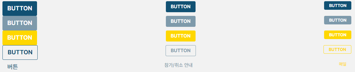
버튼에 관한 좋은 레퍼런스 사이트는 너무 많다. 막말로 아무거나 검색해서 갖다 쓰기만 해도 평타는 친다. 나처럼 남들 거 조금 따라해놓고 지가 만든 것처럼 글 올리는 사람들의 글이 홍수처럼 쏟아지기 때문에 그런 수고를 덜으시라고 버튼 관련 레퍼런스 사이트들을 모아봤다.
◇ 인파
[CSS] 🎨 버튼(Button) 디자인 스타일 모음
Codepen에서 괜찮은 디자인을 뽐내는 CSS 템플릿중에 버튼 디자인 요소들 모아 간추려 포스팅 해보았다. 급하게 CSS 템플릿을 찾으면서도 모던하면서도 준수한 디자인 예시를 원할때 좋은 참고가
inpa.tistory.com
◇ 베스트 모음집
65 cool CSS Buttons - with Animations!
65 cool CSS buttons with animations & hover effects: Discover pretty and extraordinary CSS buttons in different designs and styles!
webdeasy.de
◇ 벨로퍼트(참고한 사이트)
1. Sass · GitBook
01. Sass Sass (Syntactically Awesome Style Sheets: 문법적으로 짱 멋진 스타일시트) 는 CSS pre-processor 로서, 복잡한 작업을 쉽게 할 수 있게 해주고, 코드의 재활용성을 높여줄 뿐 만 아니라, 코드의 가독성을
react.vlpt.us
'개발일지' 카테고리의 다른 글
| 프로젝트 SPAM #7 타입에러 2571 (6) | 2023.03.24 |
|---|---|
| 프로젝트 SPAM #6 UI설정(3) (6) | 2023.03.17 |
| 프로젝트 SPAM #4 UI 설정(1) (6) | 2023.03.14 |
| 프로젝트 SPAM #3 아이콘 폰트 (10) | 2023.03.06 |
| 프로젝트 SPAM #2 초기 설정 (11) | 2023.02.27 |